Why Chicago’s skyscrapers look so different: three ideas visible from the street

Chicago’s tall buildings do not speak with one architectural voice. A dark masonry wall, a pair of rounded concrete towers and a glass building edged with irregular white balconies can all belong to the same city. Their differences become more interesting when you stop treating each silhouette as a shape to identify and start asking what problem its designer was addressing.
Monadnock, Marina City and Aqua offer three useful questions: how can height be supported, how can everyday life be organised vertically, and how can a tall façade make room for people outdoors? These are overlapping ideas, not a complete history of the skyscraper. You can begin noticing them from public places without entering an apartment, office or private terrace.
Look for a question before looking for a style name
A style label can be useful, but it does not explain everything you see. Begin with the relationship between a building’s parts: wall and window, repeated floor and central body, interior and balcony. The visible details become evidence for a question. They do not let you diagnose an entire structural system simply by glancing at the surface.
Shape your personal Chicago trip with RoadMe around your dates, interests and preferred pace. Give architectural observations space within the whole stay, alongside other visits, travel and pauses.
The three examples are not a claim that architecture progressed neatly from heavy brick through concrete to flowing glass. Different materials and arrangements continue to serve different purposes. Nor are they a measured short walking route. Choose the examples that fit the part of the city you are visiting, and plan the actual journeys separately.
It also helps to distinguish observation from explanation. “The window sits deep in the wall” describes something visible. “The entire building works in this exact way” requires further evidence. Keep both levels in the conversation, but do not confuse them. A visitor can enjoy architectural reasoning without pretending that the pavement provides an engineering inspection.
Monadnock: supporting height and reading a substantial wall
At Monadnock, begin with the north part and the impression of a continuous masonry body. Its construction relied primarily on load-bearing brick walls. The southern extension introduced a different arrangement, including a fully steel-framed southern quarter. That distinction is more precise than calling the whole complex a single pure brick system or describing every part of its southern half as identical.
The north and south portions were designed by different firms: Burnham and Root, then Holabird and Roche. You do not need to memorise their biographies to notice that one apparent building contains a change in architectural thinking. Comparable overall scale and colour can make the contrast less obvious at first. Looking longer reveals more than a quick glance at the roofline.

From a public pavement, look at the depth of the window openings, the treatment of the base and the repeated arrangement above. A substantial wall can give a sense of weight before you know any technical term. Describe that impression honestly. It becomes a starting point for understanding construction, rather than a rule that every thick-looking brick façade must carry the floors behind it.
A useful exercise is to separate the opening from its frame. Where does your eye stop: on the solid material or on the glass? Then ask how the repeating windows give scale to a large block. This is your own reading of the composition, not a measurement of structural loads. It is enough to turn an otherwise anonymous office building into something you can examine.
The building remains a working commercial place. Public observation does not imply permission to explore offices, lifts or private corridors. If an interior visit or organised tour matters to you, check an actual arrangement for your dates. Do not turn a photograph of a lobby into a promise of unrestricted access. The exterior already offers a meaningful architectural subject.
Marina City: making a city within a city
Marina City changes the question from a wall carrying height to the organisation of urban life. Bertrand Goldberg’s complex brought together housing and other uses in an ambitious alternative to a downtown occupied only during working hours. The original vision matters more than a list of facilities: it asked whether everyday activity could be concentrated in a vertical community.
The paired cylindrical towers and repeated petal-like balconies give that idea a distinctive concrete form. Their outline differs strongly from a flat rectangular curtain wall. Look for the rhythm of the projections around the body, not just the familiar nickname suggested by their appearance. A nickname helps recognition, but does not explain the relation between repeated parts and the whole.

From a permitted public view, compare the rounded outline with the horizontal repetition of floors. One gives a strong overall identity; the other gives it scale. Looking at a single balcony, then at many together, produces two different readings. The small part belongs to someone’s daily surroundings, while the collection becomes a city landmark visible from much farther away.
Do not translate the historical program directly into a present-day visitor checklist. An activity included in the original scheme may have changed, and a residential balcony is not a public viewing deck. The story concerns an architectural approach to living in the city. It does not entitle visitors to enter homes, parking areas or other controlled parts of the complex.
Concrete is important here because it helped give architectural expression to curving forms. That does not establish that concrete always produces rounded buildings, or that a round outline is only an engineering decision. Material, design ambition and the social program interact. The visible silhouette is a result of those relationships, rather than a simple recipe associated with one material.
Ask yourself how the appearance might change if you removed the repeated outdoor edges from your mental picture. The towers would lose a major part of their recognisable rhythm. This is an observation exercise, not a proposal for alteration. It helps you see why the relationship between an individual dwelling and the collective outline matters to the architecture.
Aqua: the façade as inhabited outdoor space
At Aqua, designed by Studio Gang led by Jeanne Gang, the varying edges of the floor plates create the familiar undulating surface. Their development responds to views, sunlight and use, rather than a single repeated wave placed over every level. The tower asks how outdoor connections can be made within a tall building and how those connections can shape its public appearance.
Look for the contrast between the underlying tall volume and the changing white horizontal edges. Some parts project farther, others retreat. A view from below can emphasise overlapping layers; another public viewpoint may make the broader pattern easier to read. Neither viewpoint provides the complete experience of living behind those edges, but both make the design question visible.
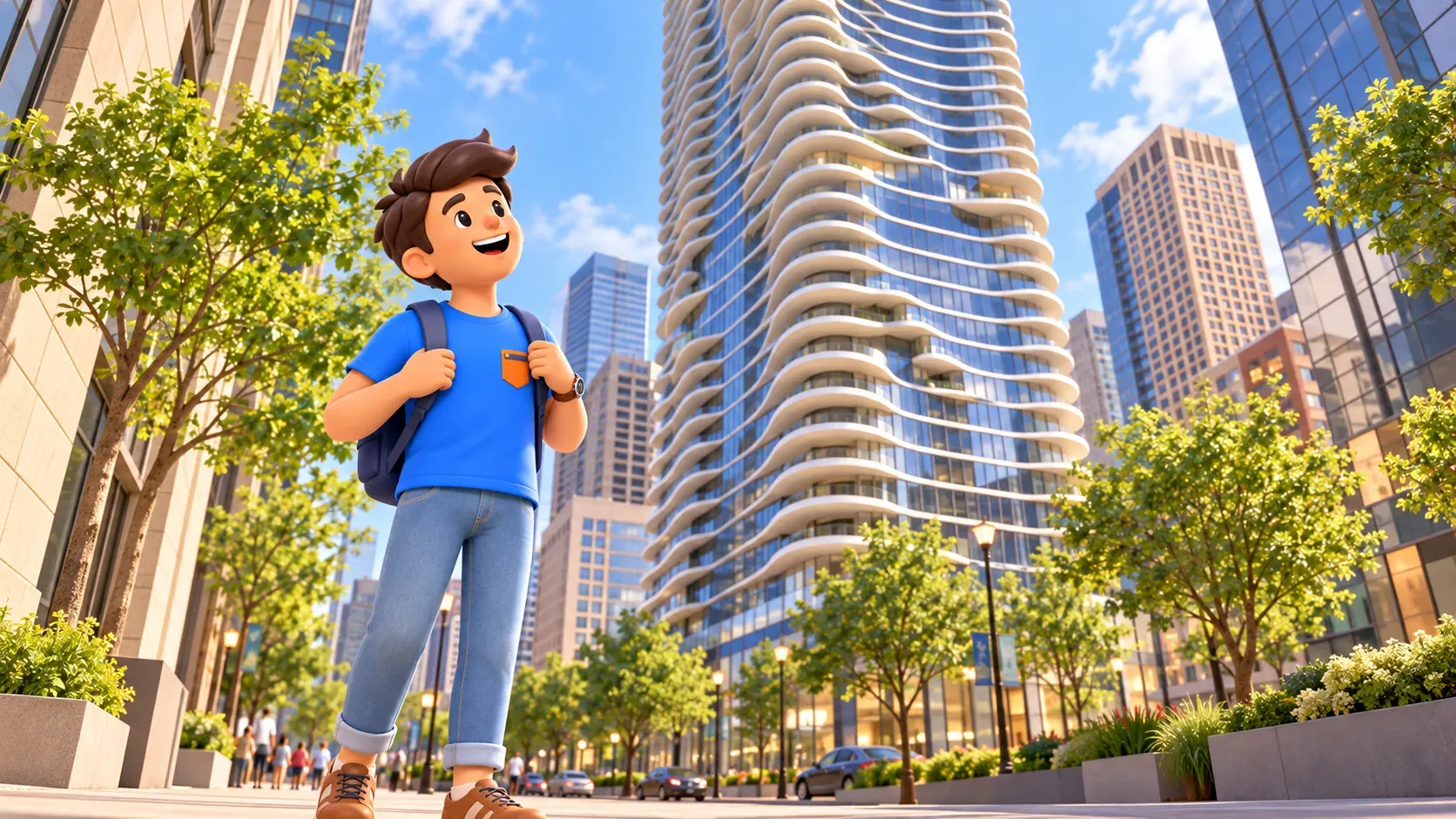
The balconies belong to real uses of the building, not to a public promenade running around the tower. Their presence is therefore an invitation to observe architecture, not an access promise. Keep the distinction between an outdoor space designed for occupants and a public place available to passing visitors. It is particularly easy to lose that distinction in striking photographs.
Calling Aqua a wave can be a useful visual comparison. It becomes less useful if it replaces the explanation entirely. Ask what changes from one level to another and how projecting edges affect the relation between inside and outside. You need not assign a precise function to each curve. The design responds to several conditions, and a street view cannot prove every local decision.
Light also changes how the surface reads. The architectural elements remain, but the contrast between edges and shadow may differ across the day. You do not need to wait for a supposedly perfect photographic hour to understand the principle. Look at what your actual conditions reveal, and treat a different published image as another observation rather than a required standard.
Compare the three ideas without ranking the buildings
Monadnock offers a way into material and support, Marina City into the organisation of a vertical community, and Aqua into inhabited outdoor edges. Each building also raises the other questions. These are selected ways of reading them, not exclusive definitions. A building is never reduced entirely to the one feature that makes it convenient to explain.
Use RoadMe to build the whole personal trip around the architecture and experiences you enjoy. Choose observations that fit your days and pace, leaving room for the journeys between them.
Rather than deciding which example is most advanced, try describing what each makes visible. One can emphasise mass, another a repeated radial pattern, another changing horizontal outlines. Then consider what remains hidden: private rooms, structural details and the daily experiences of occupants. Acknowledging those limits makes the comparison more precise, without reducing its pleasure.
Make street observation part of the visit
Choose a safe public place where you can stand without blocking movement. Look at the whole building, a repeated element and its connection to street level. Three changes of attention can be more useful than taking the same wide photograph repeatedly. You may use a notebook, but no drawing skill is required: ordinary descriptive words are enough to record what caught your eye.
If you decide to see more than one example, check contemporary directions and conditions for the actual journey. This article does not supply a timed circuit, interior reservation or guaranteed access to every attractive perspective. Leave space for weather, traffic and a pause. A thoughtful architectural observation need not turn into a race across downtown.
The distinction between an inherited building and its changing role also appears in the legacy of Chicago’s 1893 World’s Fair. Here the useful souvenir is a set of questions. Once you start asking about support, daily life and outdoor space, Chicago’s different silhouettes become easier to read as architectural choices.