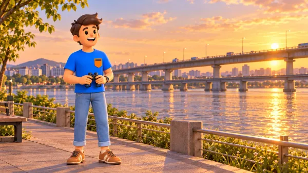
Plainpalais neon: an evening walk through Geneva’s open-air art
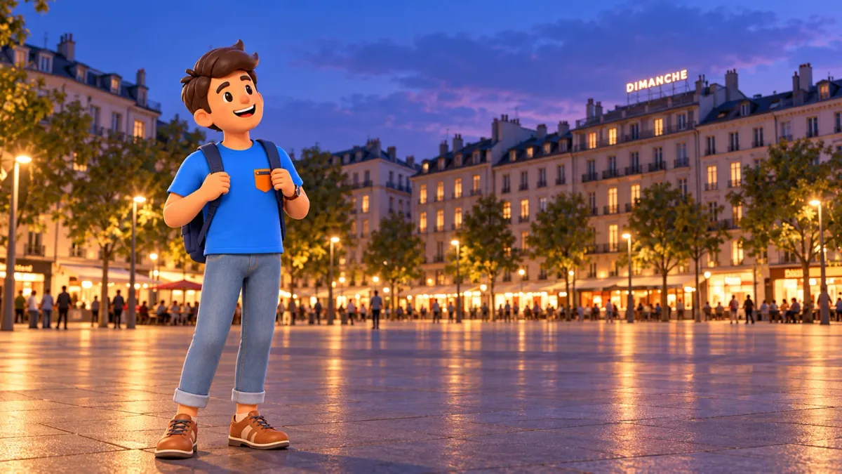
At Plainpalais in the evening, look above the shopfronts. Words, geometric lines and images occupy the rooflines of ordinary city buildings. At first, some could pass for advertising. Their purpose is different: rather than telling you what to buy, they invite you to notice how a city addresses the people moving through it.
Neon Parallax makes a rewarding subject for a short walk after daytime museums or before dinner. Follow part of the square, compare a few works and meet a contemporary side of Geneva without committing to a long tour. This itinerary uses selected works from the RoadMe collection; it is a manageable circuit, not a complete project catalogue.
Planning an evening around Plainpalais
Begin near the northern end of the Plaine de Plainpalais with DIMANCHE. Follow public pavements along the eastern side, associated with Boulevard Henri-Dunant, then continue towards the southern end. Return north on the Avenue du Mail side. The open space provides distance from which to appreciate works installed above the surrounding buildings.
RoadMe makes it much easier to turn an interest in contemporary art into a complete personal evening or trip plan, shaped around your interests and pace. Try arranging a Geneva day that leaves proper time for these smaller discoveries.
Allow roughly an hour for a selective circuit, or less for three or four works if you keep the stops brief. This is a planning estimate, not a measured walking time. Conversation, photography, crossings and events on the square can all change the duration. There is little benefit in making the evening a race to collect every title.
Dusk is a useful viewing intention, with rooflines beginning to stand out against the changing sky. A current exact switching schedule for every installation has not been confirmed here. Public outdoor space does not mean the lights operate around the clock. Keep the plan flexible and appreciate the works that are visible during your visit.
Why the art occupies the roofs
The public-art project, developed by Geneva’s city and cantonal contemporary art funds, began in 2006, with its first works appearing in 2007. It takes a format familiar from the city’s illuminated commercial signs, especially around the lake, and gives it an artistic role around Plainpalais.
A useful opening question is therefore straightforward: why does one sign feel like advertising while another makes you pause? The difference may lie less in brightness, scale or material than in the absence of a clear offer. Nothing is being sold, yet your attention has already been captured. A joke, uncertainty or personal association can enter that space.
The square remains a working public place. A market, an event, passers-by and traffic belong to the setting. These works are not isolated behind museum walls, and an accidental urban backdrop can influence your response. Do not expect an empty square or a single perfect viewing position that will always be available.
DIMANCHE: begin with one familiar word
Near the northern part of the square, look for Christian Robert-Tissot’s DIMANCHE, meaning Sunday. A single word along a roofline offers a particularly clear introduction. It has the visual confidence of a sign while withholding the practical commercial information you might expect from one.
From a comfortable public viewpoint, separate meaning from form. First read the word as a message. Then consider the spacing of the letters and the relationship between the inscription and its building. Finally, ask what changes when Sunday appears during an ordinary working day or a weekday evening.
You do not need to arrive at the one correct interpretation. Comparing first reactions with a companion is a good beginning. The word might suggest rest, an empty street or unfinished plans. The work has already become a conversation, even without a detailed account of the artist’s biography.
Instead of taking many close-ups, consider one wider photograph that includes part of the building. It preserves the relationship between text and architecture. Isolated glowing letters can lose precisely the urban context that makes the stop worth seeking out.
If you are walking alone, make a brief note of your first response before reading an explanation. Comparing that reaction with the next work can be just as rewarding as discussing it with a companion.
The eastern side: expectation, geometry and reading
Continue along available public pavements on the eastern perimeter. Several different approaches make this stretch a useful comparison rather than a repetition of one idea. Walk normally between stops and look upwards once you have found a safe place to stand.
Coming Soon!: a promise without a poster
Pierre Bismuth uses Coming Soon!, a phrase familiar from film promotion. In an ordinary advertisement you would expect a title, release date or product to follow. Here, expectation itself becomes the material. What exactly is coming, and why are we so ready to accept the promise?
Notice how the phrase sits among everyday façades. There is no need to solve it as a puzzle with one answer. Recognising your own habit of waiting for the rest of an advertising formula is enough. That small observation suits a walk focused on looking rather than absorbing long explanatory panels.
Fly a Dragon Kite: a pause from words
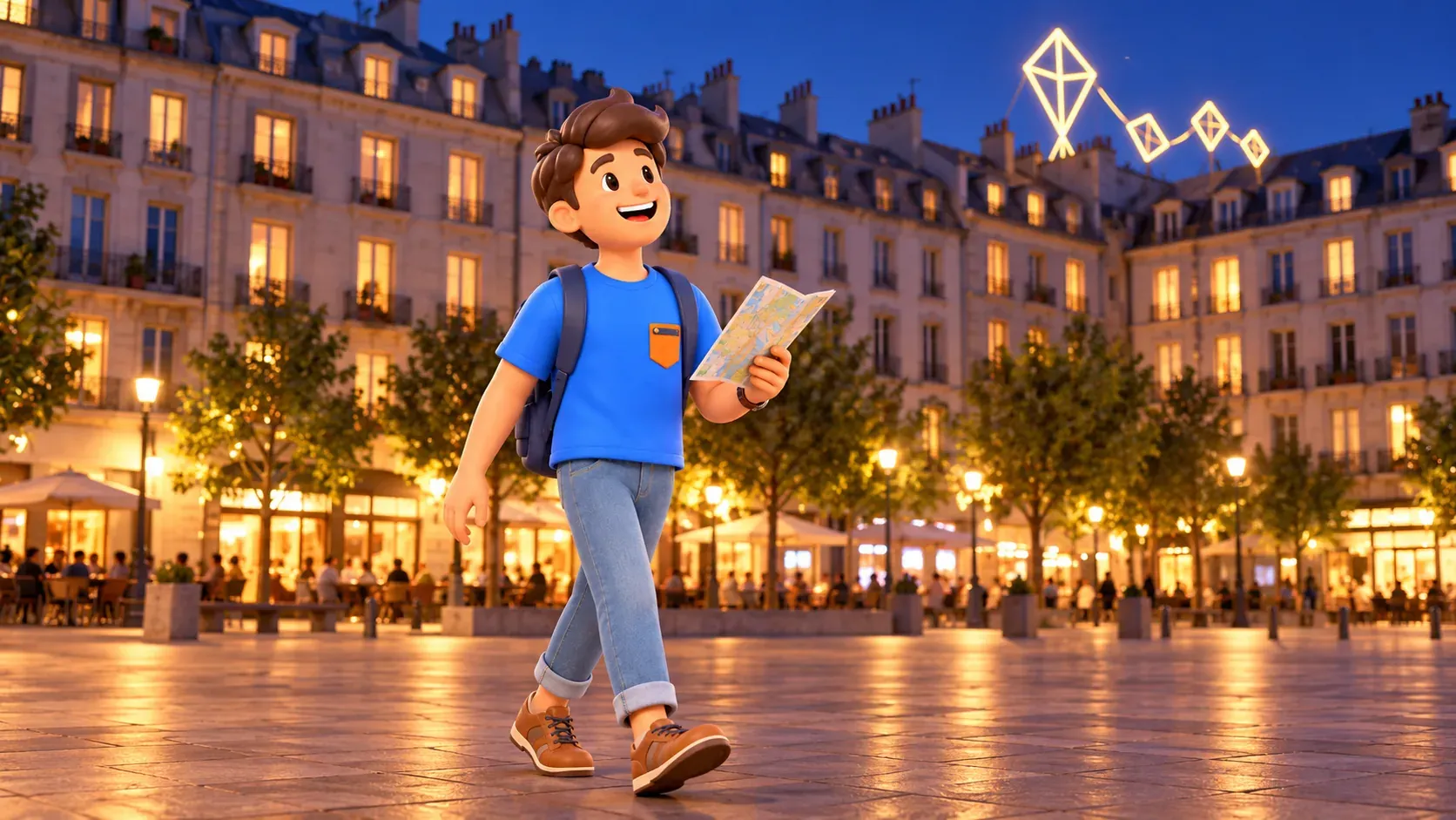
In Nic Hess’s work, illuminated diamond shapes suggest a kite. After the first text-based stops, this is a welcome change of language. Follow the direction of the lines and the movement of your gaze, then consider how the geometry relates to the substantial horizontal roof beneath it.
A perfect angle is not worth pursuing at any cost. If urban activity partly blocks the view, choose an available position on the public route. The work belongs above the street; you do not need access to a roof or a residential stairwell. The point is to look at the city from within its shared space.
Ann Veronica Janssens and the scrambled phrase
The title L’ODRRE N’A PAS D’IPMROTNCAE looks wrong intentionally. The rearranged letters belong to the artwork and should not be corrected as an accidental typo. The work plays with the way the eye and brain recognise a familiar phrase before carefully inspecting every letter.
Try reading it quickly and then more slowly. Does the experience change? Discussing it with a companion can be enjoyable, but this is not a French test. If you do not know the language, you can still appreciate the rhythm of the line and the way the text occupies the space above a building.
The southern end: YES TO ALL and the language of agreement
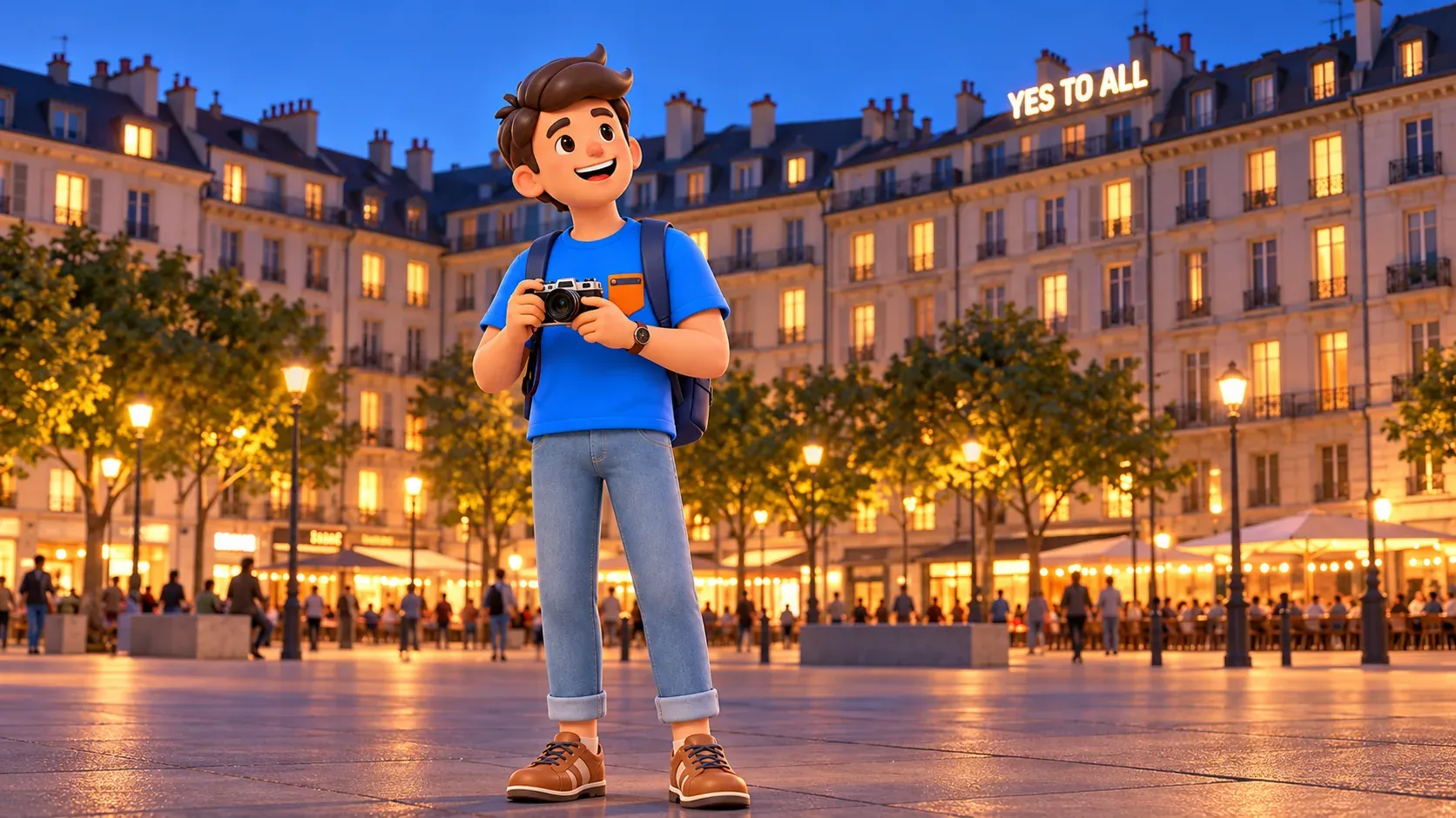
As you continue south, cross streets only at the designated places. Sylvie Fleury’s YES TO ALL is another strong reference point. Its short formula can resemble a slogan, a confident promise or an invitation to agree. In an artistic setting, that apparent certainty leaves room for questions.
Compare it with Coming Soon! One holds attention through expectation; the other offers unconditional agreement. Both are simple to read and quickly remembered. Yet immediate legibility does not necessarily produce a single, obvious meaning.
Give yourself a few minutes without a camera. Evening art can easily become an exercise in testing how well a phone records bright lights. A personal impression may arrive before the successful photograph, through the scale of the words, their height and their unexpected coexistence with ordinary urban life.
Returning along the Avenue du Mail side
Heading north along the western perimeter, consider Christian Jankowski’s What I Still Have to Take Care of. Its title evokes a private, unfinished to-do list. Transferred to the scale of a public city setting, that intimate tone changes: someone’s inner concern sits above a space shared by everyone.
Further along, Sislej Xhafa’s Axis of Silence uses illuminated eyes. After the text-based stops, this offers another way to address a passer-by without a conventional sales message. Notice the change in the direction of attention: you are looking at a work that itself brings observation to mind.
To connect an evening at Plainpalais with museums, other neighbourhoods and the rest of your trip, let RoadMe work out a personal plan around your interests and available time. The app makes arranging a coherent route much more convenient and effective than piecing the day together from scattered notes.
This is enough to complete a selective circuit. The seven works in the original collection already offer different languages: a single word, a promise, geometry, disrupted reading, a slogan, an intimate phrase and an image. You do not have to like them equally for the comparisons to make a worthwhile evening.
Keeping the selection realistic
Neon Parallax continues to develop. Works by Dora García and RM were added in January 2026. They fall outside this original selection, so the proposed walk should not be treated as a complete current inventory. Older lists and photographs also need care: Breath was dismantled in 2017 and is not a viewing stop for this evening.
For a shorter version, choose three or four contrasting impressions: DIMANCHE, the kite geometry, the scrambled letters and YES TO ALL. Do not take shortcuts across traffic to preserve an ideal sequence. A proper crossing matters more than the order of titles, and a usable viewpoint matters more than ticking off every work.
If some lights are off, avoid guessing the reason or assuming they will shortly switch on. Enjoy the visible pieces and their setting, then decide whether to continue. During a large event, use open perimeter pavements; an enclosed event area does not become part of the public walking route.
Viewing from public space does not require museum admission. Drinks and transport belong to your own budget. Dress for the conditions and leave the evening some breathing room. The most lasting discovery may be a modest one: after the walk, an ordinary illuminated city sign no longer looks quite as familiar.